Build a simple cohort visualization with Python, Metabase and SQL

Cohort analysis is a handy way to understand the impact of changes over time, like tweaking prices or offerings. These adjustments can significantly impact conversion rates for new users and influence retention rates, making cohort analysis an invaluable resource for businesses seeking actionable insights.
Surprisingly, many Growth and Data teams don't use this powerful tool, possibly due to a focus on the top of the funnel or a lack of hands-on experience.
In this blog post, we will guide you through the step-by-step process of building a SQL query to create a cohort view, and we'll explore two methods of visualization: using Python and Metabase.
Step 1: Building the database and the data
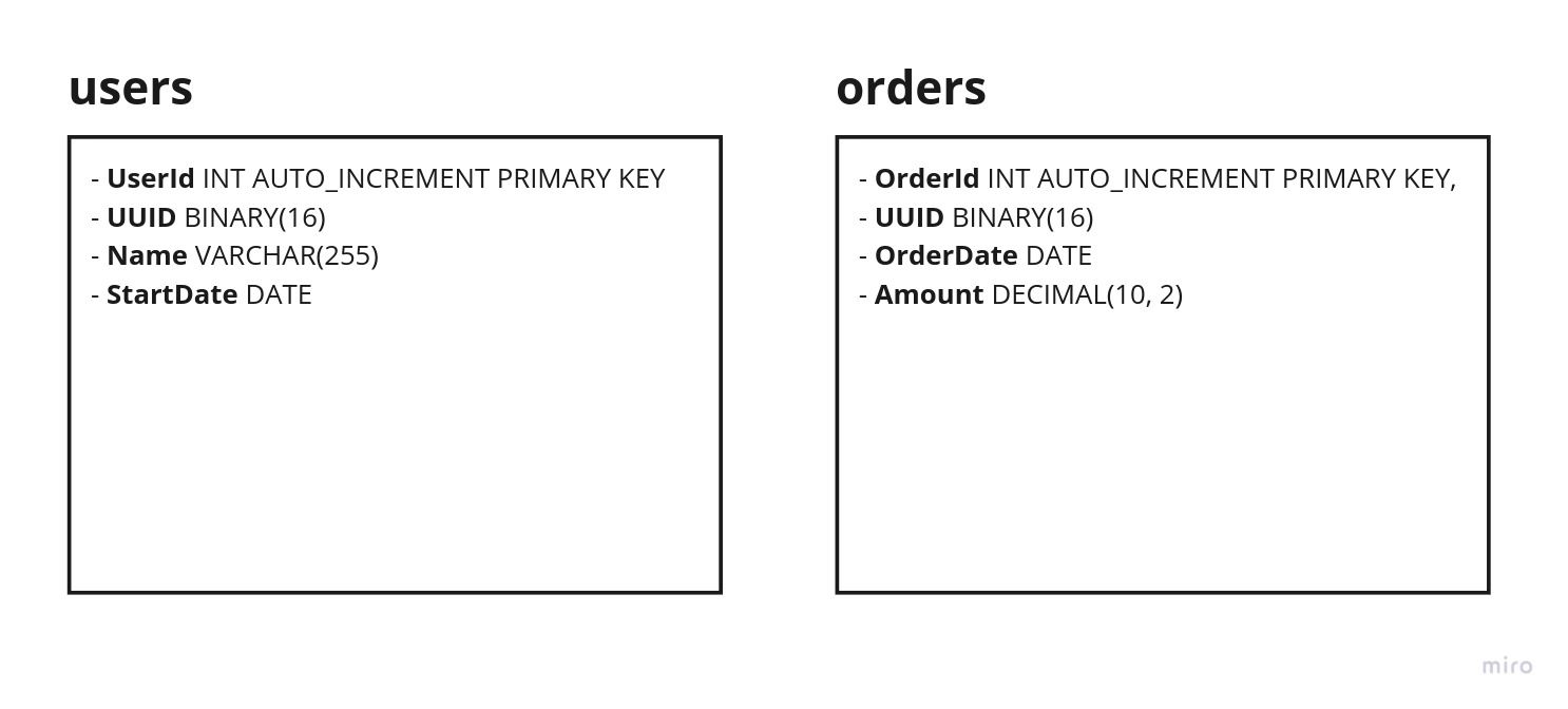
To illustrate the process, we will create a cohort view based on the first purchase and monthly orders since January 2023, utilizing two tables.

You can find a Python script for creating the necessary MySQL tables and populating them with random data here. Remember to replace the placeholder credentials with your MySQL connection details:
conn = mysql.connector.connect(
    host='host',
    user='user',
    password='password',
    database='demo_cohorts'
)
Step 2: Building the SQL query
Now that our tables and data are ready, let's make the SQL query. For simplicity, we'll use MySQL:
WITH monthly_sales AS (
    SELECT
        UUID AS user_id,
        MIN(DATE_FORMAT(OrderDate, '%Y-%m-01')) AS cohort_month
    FROM
        orders
    WHERE
        OrderDate >= DATE_SUB(NOW(), INTERVAL 12 MONTH)
    GROUP BY
        UUID
),
monthly_sales_data AS (
    SELECT
        UUID AS user_id,
        DATE_FORMAT(OrderDate, '%Y-%m-01') AS order_month,
        COUNT(*) AS monthly_sales
    FROM
        orders
    WHERE
        OrderDate >= DATE_SUB(NOW(), INTERVAL 12 MONTH)
    GROUP BY
        UUID, order_month
)
SELECT
    c.cohort_month,
    msd.order_month,
    COUNT(DISTINCT c.user_id) AS cohort_size,
    COALESCE(SUM(msd.monthly_sales), 0) AS monthly_sales
FROM
    monthly_sales c
LEFT JOIN
    monthly_sales_data msd
ON
    c.user_id = msd.user_id
    AND c.cohort_month <= msd.order_month
GROUP BY
    c.cohort_month, msd.order_month
ORDER BY
    c.cohort_month, msd.order_month;
Let's break down the query:
- Common Table Expressions (CTEs):
monthly_sales: This part identifies the cohort for each user based on their earliest order date within the last 12 months. It retrieves the user ID (UUID) and the corresponding cohort month, which is the first day of the month when the user made their first purchase.monthly_sales_data: This CTE retrieves the monthly sales data for each user within the last 12 months. It includes the user ID, the order month (first day of the month when the order was placed), and the count of orders for that user in each month.
- Main Query:
- The main query performs a left join between the two CTEs (
monthly_salesandmonthly_sales_data) based on the user ID and the condition that the cohort month is less than or equal to the order month. - It then groups the results by the cohort month and order month.
- The
COUNT(DISTINCT c.user_id)calculates the cohort size, representing the number of unique users in each cohort. - The
COALESCE(SUM(msd.monthly_sales), 0)calculates the sum of monthly sales for each cohort and order month.COALESCEis used to handle cases where there are no sales in a particular month, ensuring that a 0 is returned instead of a NULL.
- The main query performs a left join between the two CTEs (
- Result Sorting:
- The results are ordered by cohort month and order month.
You can easily tweak this query using your own data and use case.
Step 3a: Visualize it with Python
Now, let's bring your cohort analysis to life using Python. We'll make use of 3 essential packages: pandas (for data manipulation), pyplot, and seaborn (for creating visualizations).
hese packages are widely used by Data Scientists for data analysis.
To get started, make sure you have these packages installed. You can do this by running the following commands in your Python environment:
pip install pandas matplotlib seabornOnce installed, incorporate the following code into your Python script (remember to replace the MySQL credentials:
import mysql.connector
import pandas as pd
import seaborn as sns
import matplotlib.pyplot as plt
import matplotlib.colors as mcolors

# Connect to the MySQL database
conn = mysql.connector.connect(
    host='host',
    user='user',
    password='password',
    database='database'
)

cursor = conn.cursor()

# SQL query for user cohort and monthly sales for the last 12 months
cohort_query = """
WITH monthly_sales AS (ls
    SELECT
        UUID AS user_id,
        MIN(DATE_FORMAT(OrderDate, '%Y-%m-01')) AS cohort_month
    FROM
        orders
    WHERE
        OrderDate >= DATE_SUB(NOW(), INTERVAL 12 MONTH)
    GROUP BY
        UUID
),
monthly_sales_data AS (
    SELECT
        UUID AS user_id,
        DATE_FORMAT(OrderDate, '%Y-%m-01') AS order_month,
        COUNT(*) AS monthly_sales
    FROM
        orders
    WHERE
        OrderDate >= DATE_SUB(NOW(), INTERVAL 12 MONTH)
    GROUP BY
        UUID, order_month
)
SELECT
    c.cohort_month,
    msd.order_month,
    COUNT(DISTINCT c.user_id) AS cohort_size,
    COALESCE(SUM(msd.monthly_sales), 0) AS monthly_sales
FROM
    monthly_sales c
LEFT JOIN
    monthly_sales_data msd
ON
    c.user_id = msd.user_id
    AND c.cohort_month <= msd.order_month
GROUP BY
    c.cohort_month, msd.order_month
ORDER BY
    c.cohort_month, msd.order_month;
"""

# Create a DataFrame from the query result
cohort_data = pd.read_sql_query(cohort_query, conn)

# Format Amount in Euros
cohort_data['monthly_sales'] = cohort_data['monthly_sales'].astype(float)

# Pivot the cohort data into a cohort table
cohort_table = cohort_data.pivot(index='cohort_month', columns='order_month', values='monthly_sales')

# Create a Seaborn heatmap
plt.figure(figsize=(12, 8))
sns.heatmap(cohort_table, annot=True, cmap='YlGnBu', fmt='.0f', cbar=False)
plt.title('User Cohort Monthly Sales Analysis', fontsize=16)
plt.xlabel('Order Month')
plt.ylabel('Cohort Month')
plt.show()

# Close the database connection
conn.close()
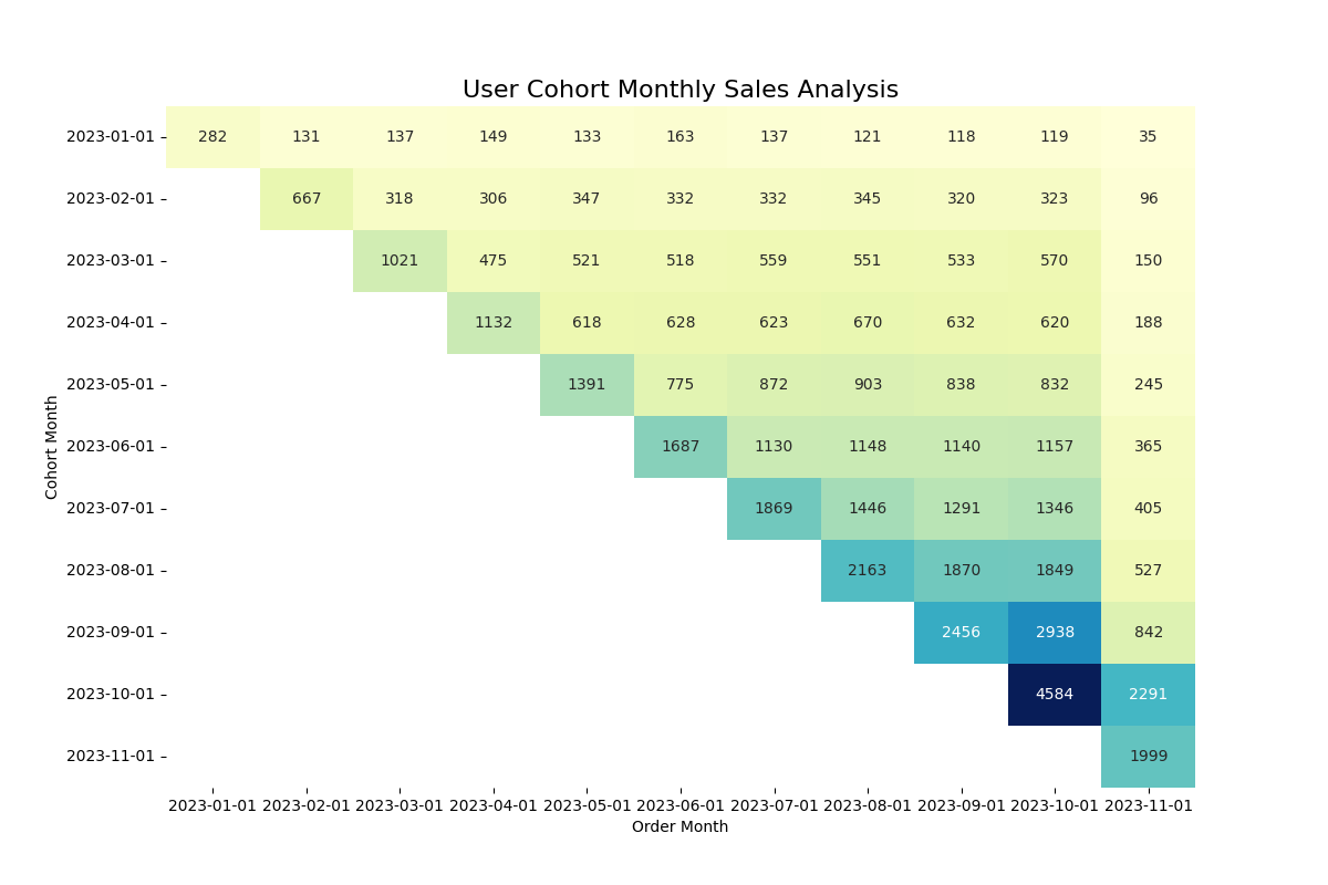
This code snippet will help you generate a meaningful cohort visualization, providing a clear representation of your data trends.

Step 3b: Visualize it with Metabase
If you're new to Metabase, start by checking out my tutorial on how to get started. This will help you navigate the platform and understand its key features.
- Connect MySQL Database to Metabase:
- Navigate to "Browse data" and click on "+ New."
- Select your MySQL database to establish a connection.
- Create SQL Query:
- Return to the home screen and click on "+ New" (top right corner).
- Choose "SQL query."
- Copy and paste your customized SQL query into the editor and hit "Run."
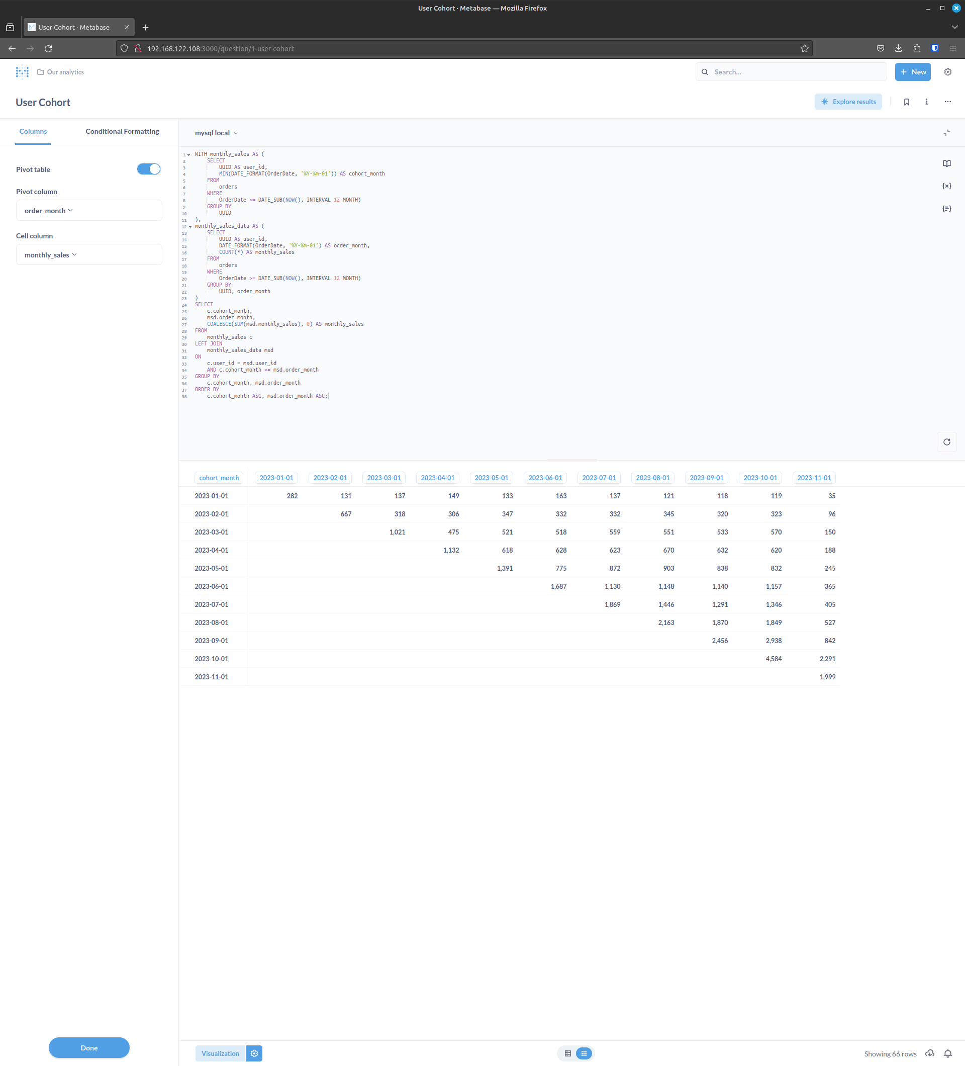
- Configure Visualization:
- Once the query runs successfully, click on the visualization configuration icon (⚙️) at the bottom.
- Toggle to select "Pivot table."
- Select Pivot Table Columns:
- Choose "order_month" for the Pivot Column.
- Select "monthly_sales" for the Cell Column.
- Finalize Configuration:
- Click on "Done" to confirm your visualization settings.
- Add to Dashboard:
- Now, you have a visual representation of your cohort analysis.
- To include this visualization in a dashboard, click on the dashboard icon or navigate to the dashboard section.
- Add a new dashboard and include your cohort analysis visualization.


Comments ()